Articles · · Читати українською
Your university website has tens of thousands of pages. An applicant needs one
Two universities cut their sites several times over and received more applications. How many pages leading Ukrainian universities have, and what it means for university leadership.
When a university wants more applicants, it usually adds: new sections, banners, news, separate faculty sites. Two American universities did the opposite. They threw out most of their site, and applications went up.
Case 1. Eastern Washington University: from 300+ admissions pages to 40+
The website team rewrote the admissions section, cutting more than 300 pages to just over 40. The content was broken into chunks, and the editors started from rough sketches of how the pages could be built. In testing, users hovered over menu sections, the content changed but the menu label did not, so the team moved the main menu from hover to click.
A year after launch, visits to the Apply page rose 36%, freshman applications rose 93%, and visits to the Visit EWU page rose 427%. All figures refer to the admissions pages.
A caveat. The university’s own team publishes these figures. Apart from “a year after launch”, it does not specify the comparison period, gives no absolute numbers, and does not say whether other factors, such as advertising, played a part. So the conclusion is that the changes clearly helped, but the redesign’s exact share cannot be measured.
Case 2. University of Redlands: from 10,000 pages to 1,200
Redlands cut its site from more than 10,000 pages to just over 1,200 and merged several university sites into one platform. The structure was built around the needs of the audience, not the university’s internal organisation: user intent and clear calls to action came first. Content governance was centralised: responsibility was split between a web team, subject-matter experts and a web governance council. The model links IT, marketing and university leadership.
After the September 2024 launch, undergraduate applications rose 21% and graduate applications rose 33%. Website inquiries from prospective graduate students rose 9%.
A caveat. The case study was written by the agency that built the site. The period and baseline are not stated. Strategy, volume, platform and search all changed at once, so the contribution of each change is not visible.
A third, more modest example. London South Bank University replaced the news slider on its homepage with a course search at the top, and rewrote the titles of more than 3,500 pages to match what applicants actually search for. Applications rose 13% against a target of 8%. The figure is published by the agency, and the period is not given.
What they have in common
Both universities removed rather than added. Every page an applicant does not read distracts from the page they must read. Eastern Washington tested its solutions on users, and Redlands gave responsibility for content to a permanent team and a council. This is our observation: without a permanent owner of the site, in a year there will be 10,000 pages again.
How many pages do our universities have
We checked the sitemaps of three leading Ukrainian universities. A sitemap is the list of pages a site offers to search engines. Two of the three have one:
The first lists about 33,000 pages.
The second lists more than 39,000, of which about 9,500 are news items and real pages, and the rest are service pages for images and files.
The third has no sitemap at all, so search engines have to guess what matters.
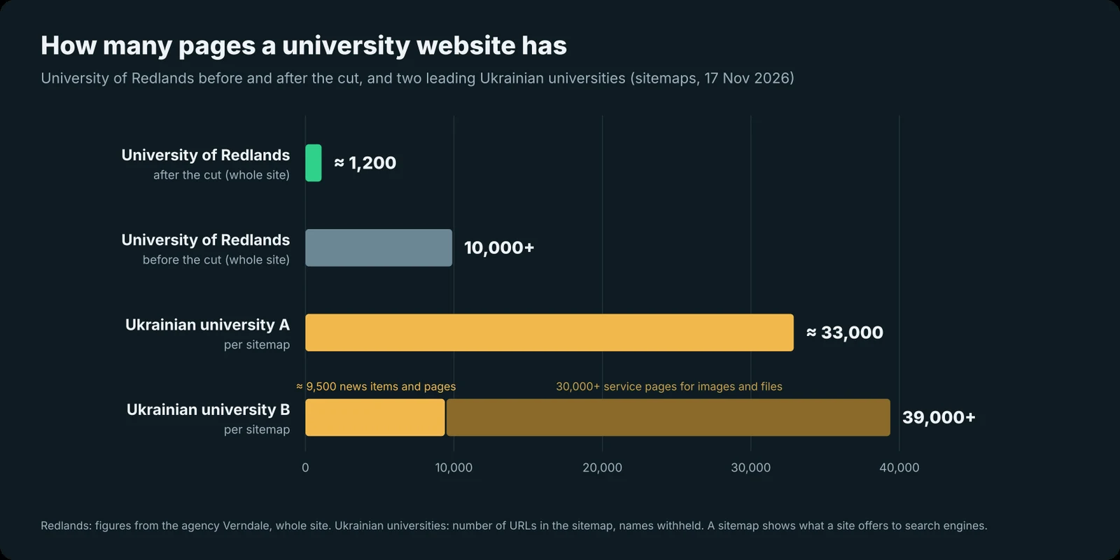
Compare this with the 300 admissions pages at Eastern Washington and the 1,200 pages of the whole Redlands site. This is not a reproach: these sites grew over the years, and every department added its own. But for an applicant it means that the answer to “how much does it cost and are there state-funded places?” is hidden among thousands of pages. And the market is lively: according to the Ministry of Education, applicants submitted 28% more applications in 2026 than a year earlier, even though each could submit only 10 instead of 15. The university that explains itself more clearly gets chosen.
“We have our own IT department”
It is the most common answer, and it is fair for what an IT department does every day: the student registry, timetable, email, Moodle, computers. An admissions website is a different matter. It needs a designer, developers, an accessibility and security specialist, and an analyst: four or five people working on it alone. A developer at that level earns from $2,500 a month, a team of five over 9–12 months costs 3–7 million hryvnias, and it still has to be found.
Another idea is “an app on top of the old site.” A separate mobile app costs roughly 682,500 to 1,638,000 hryvnias, plus another 15–20% a year for support. The old site stays underneath and confuses applicants just the same. A modern admissions site works on a phone like an app, so a separate one is not needed.
Where to start
- One page per programme: state-funded places, tuition per year, national test subjects and scores, what graduates do afterwards.
- One path to submit an application, without wandering across sections.
- Programme search on the homepage instead of a news slider.
- A person responsible for the site all year, not only in summer.
An example of such a programme page is on the demo: demo.olbo.com.ua.
How much does it cost
Such a site does not need a team of five for a year. We build programme pages, admissions and search on a ready platform, so launch takes about two months, at a fixed price in the contract. Price guidelines for websites and support are on our pricing page. The exact sum is named after the technical brief, because it depends on the number of programmes and the data to connect. If you would rather see a result first without big decisions, start with a pilot at one faculty.
A word about IT departments
When a proposal like this reaches a university IT department, they usually fear three things: that a new site will “break” what they have maintained for years; that they will be the ones responsible for security; that their work will be taken and given to outsiders. Hence the familiar advice: “we’ll do it ourselves in six months,” “let’s just update the old site,” “let’s make an app instead,” “the Google report is wrong, it’s just a bot.”
In reality, the student registry, email, Moodle and security stay with IT, and nobody disputes that. An admissions website is a separate product, and a Google report differs from a real applicant only in that the applicant closes the tab in silence.
We can show a demo built on your university’s data in 30–45 minutes. Write to hello@olbo.com.ua or leave a request.
Sources
Eastern Washington University, description of the redesign process.
University of Redlands, Verndale case study.
London South Bank University, Squiz case study.
Ministry of Education and Science of Ukraine, 2026 application results.
Sitemaps of three Ukrainian universities, checked 17 November 2026 (names withheld). This article is also published on LinkedIn.